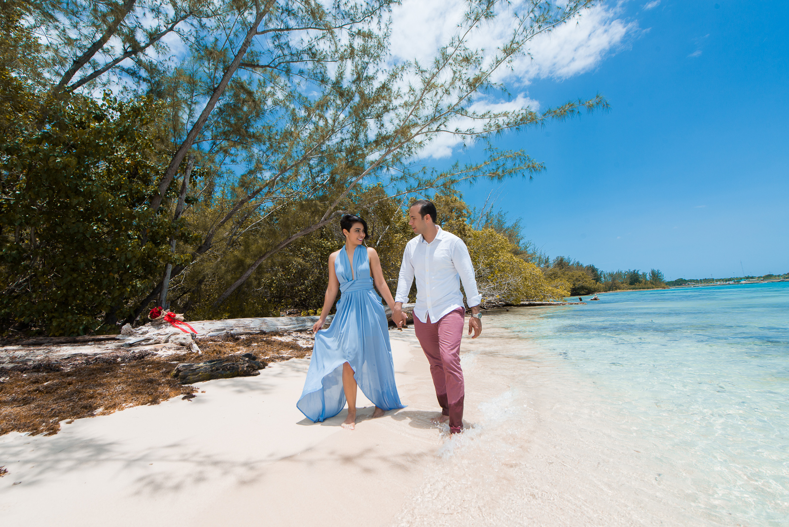
What colors to use in your photo Shoot?
This is a great starting point and inspiration for amazing color combinations, which will make choosing your outfits much easier. Follow one color scheme for your photo shoot and don’t mix it with others.
When choosing colors for your outfits, I recommend selecting lighter, neutral and more muted tones. Bright, bold, or neon colors are distracting and draw attention away from where it should be: you. You can never go wrong with light neutral colors like cream, taupe, camel, or light gray.
I usually like to have children in the brighter colors to stand out more within the group since they are the smallest, but this is not required.
Coordinate does not mean “COMBINE”. Using the same color in different shades is actually more ideal than trying to find the EXACT color. For example, I would avoid wearing blue blouses and khaki pants because it might look too uniformed.
Simple accessories work great, try to avoid very flashy accessories that could distract from the main purpose of your photo shoot.
Shoes matter a lot. Don’t have someone in dress shoes while someone else has sandals on.
What colors NOT to use in your photo session?
Color coordination is one of the most important aspects of your photo session. As a first tip, we absolutely do not recommend that everyone wear matching clothes.
It is important that there is some variation in color and styles of clothing. For best results, you don’t want everyone wearing what looks like a uniform.
Be careful with prints but don’t be afraid of them! Try to think more texture and less pattern. But I do recommend big floral patterns on dresses, just make sure all the colors are in your color palette.
Make sure you don’t put everyone in jeans. Mix it up, texture and color. Maybe the girls in skirts and the boys in chinos while dad wears jeans and so on.
It’s extremely challenging to get everyone to wear the same shade of white, unless you only have one person in white. avoid it Choose cream or ivory instead, it’s much more forgiving.
In addition to the color scheme, the use of logos and any type of graphics is also not recommended as it is too distracting. Avoid it at all costs.
We also recommend that you don’t try to wear trendy clothes as they will look outdated in a few years and we don’t want you to feel bad if you look at your photos and feel like it was a bad decision. This doesn’t mean you have to look formal at all.
Color combinations
Choosing your color combination is easy. All you need to do is choose your primary color from one of our schemes (preferably the deepest or most saturated color) and then the rest for the other outfits.
